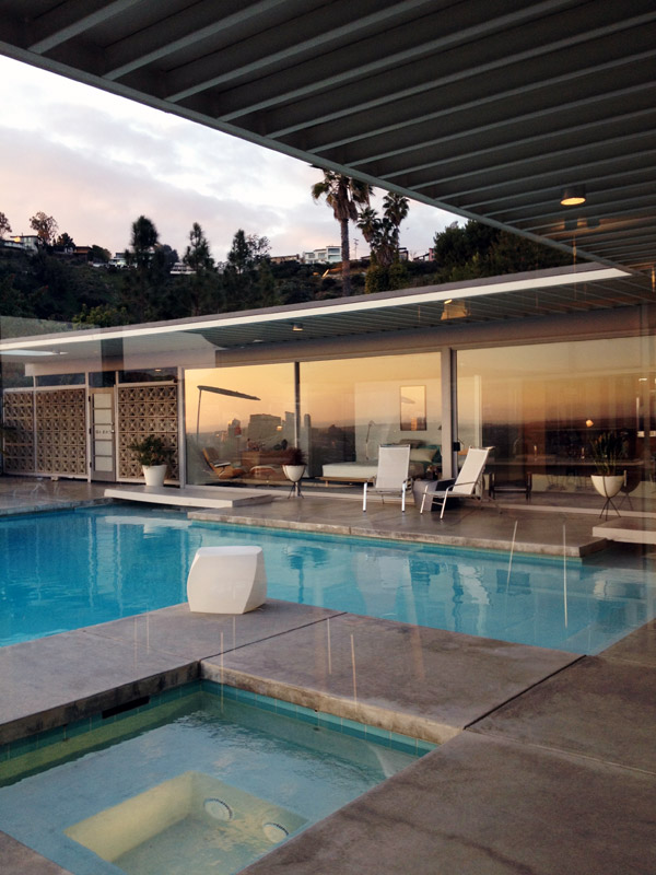
Let me start with the breeze blocks at the entrance. Why are you so sexy? Is it only me that adores them this much? I don't care how ridiculous this makes me sound.
More pictures after the jump...
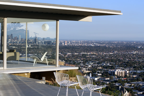
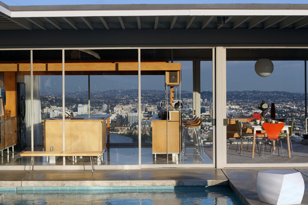 If the property looks familiar but the name doesn't, you may have previously seen the Stahl House in this photograph by Julius Schulman and if you haven't seen that photograph you may have seen the house featured in movies and if you haven't seen it in movies then maybe in fashion shoots? Or maybe this a first?
If so, allow me to introduce you to Case Study #22 also described as an "iconic example of mid century modern design" but better known as my future home. I wish.
It was designed by Pierre Koenig in 1959 and is located in Hollywood Hills. A bit of a long commute for me to work every day so sadly the house and I won't be living happily ever after together.
But we look so good together!
The house is a privately owned property filled with photographs of the Stahl family. It was ahead of its time and built predominately of steel and glass and perched high on the hills. It is basically a glass box that you can see right through but with spectacular views across Los Angeles and not of your neighbours kitchen window.
I found it interesting to learn that the Stahl family raised their small children here. There is very little protection from falls down the cliff but luckily no major injuries. A safety fence has been built a few feet down so if a person did fall off the edge they wouldn't roll all the way down the cliff. I only know this because Robbie was with me and because since his birth I'm now programmed to scope out every location we visit for potential safety hazards.
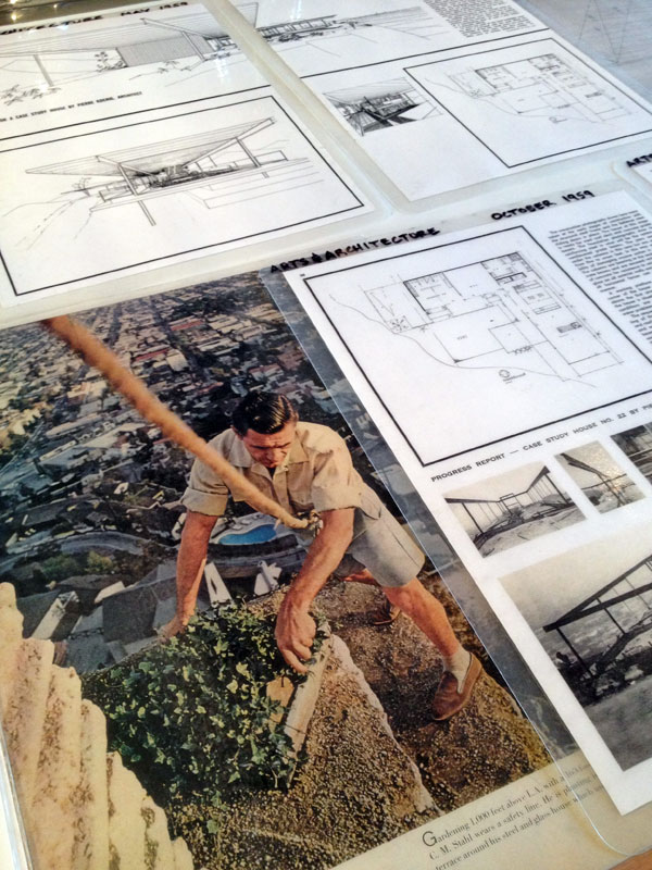
We were given access to architectural drawings and archive photos to view during the visit. The above photo shows how tricky simple landscaping jobs were to do what with having to navigate the side of the cliff with a safety rope tied around the waist.
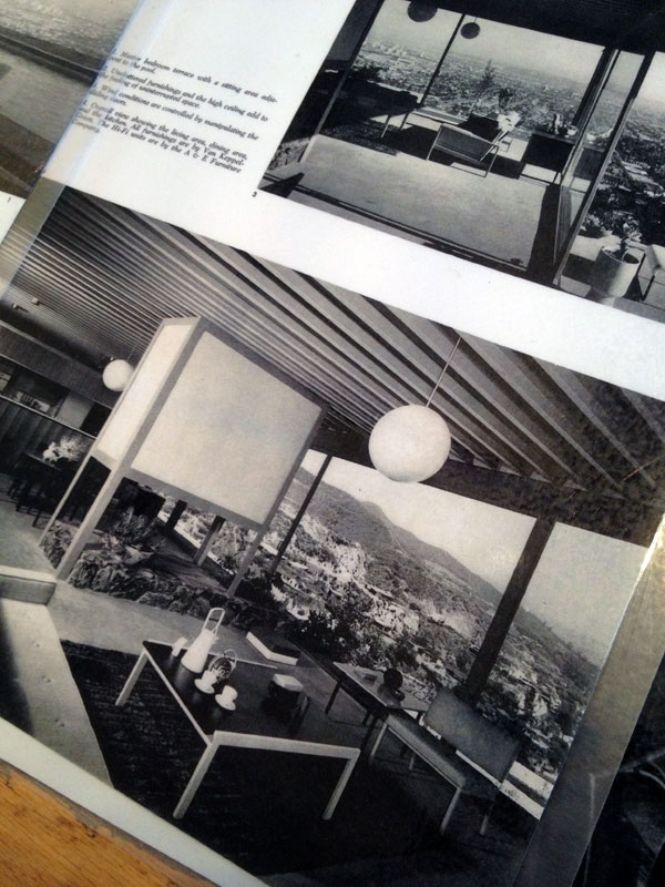
Above is how the living area looks now with local stone used for the fireplace. The fireplace didn't look this way originally though and below is a photograph of the original space. Good choice adding the stone I think.
Below is an idea that caught my eye and might look nice in a home today, if you fancy wood paneling that is (but not too much of it) - alternate it with mirrored panels to create an interesting striped feature wall that also reflects the view opposite the room.

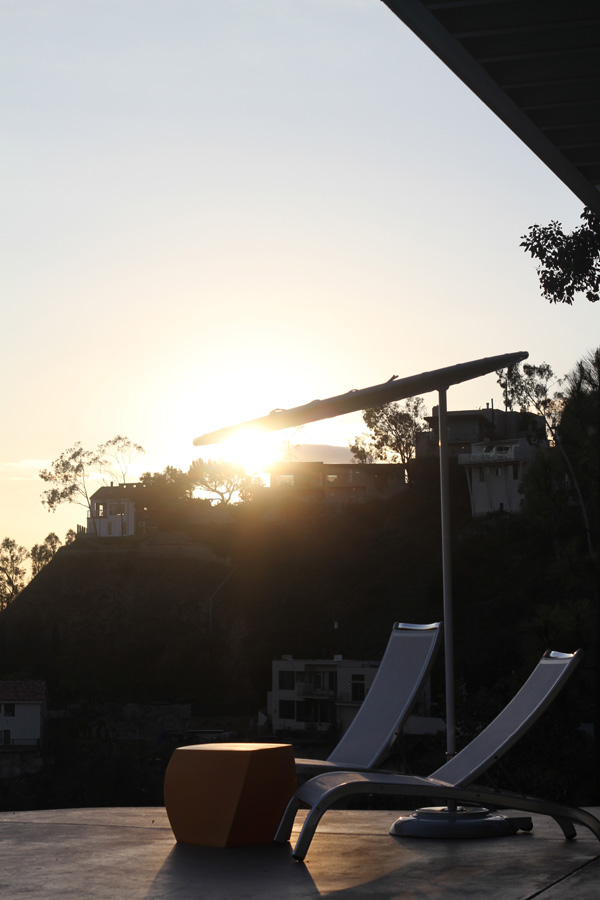
What I love about most modernist homes is their relatively small footprint in comparison to some homes built today. Give me a small house over a large house any day! This property really is a sight to see if you ever have the opportunity to visit in person. I recommend the afternoon / evening tour as it is nice to see and feel how the mood of the home changes as the sun goes down.
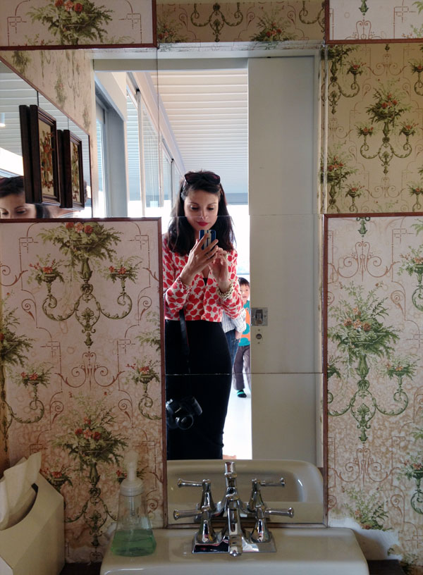
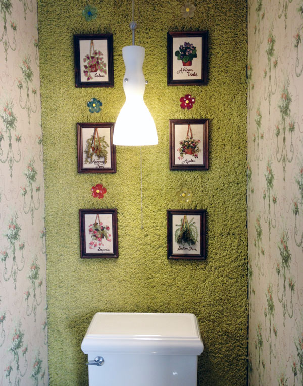
And can we talk about the shag carpet on the bathroom wall? A decorating idea you will want to try at home, right?
Yeah, baby.
This post is dedicated to my friend Emily Sephton.

