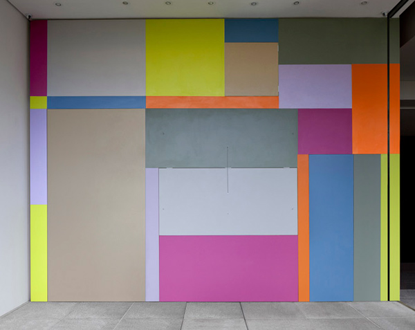
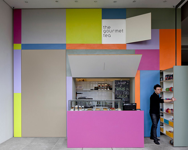
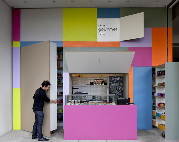
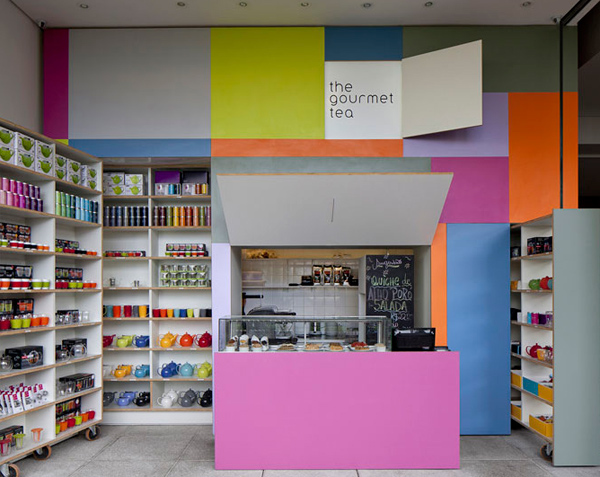
I couldn't resist sharing this project with you during this week's colour series for its simple use of colour in the overall design.
And it looks like a giant Rubik's Cube which brings out the inner child in me.
What do you think of this design for compact shop?
(Images via Dezeen. See more HERE)


