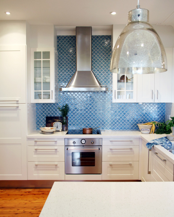
I am excited to be finally sharing with you the completed kitchen!
But first, a recap of the progress so far:
Diane and her family had been wanting to re-do
their kitchen with an updated look and to function better for the family
with more storage, large benchtops and better organisation. We’ve been working
together with IKEA to create a dream kitchen for Diane and her family that fits the
brief.
We met with IKEA to plan
the layout of the new kitchen using the in-store planning tool. Diane had
already used the tool to create a draft design for the existing space and
together with IKEA, I worked with her to tweak the design so that it works
better both functionally and aesthetically.
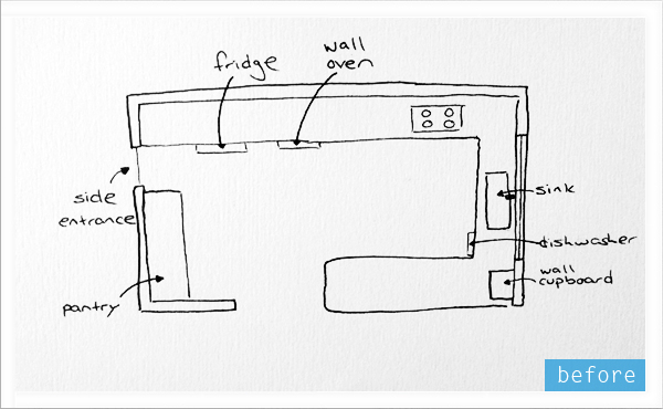
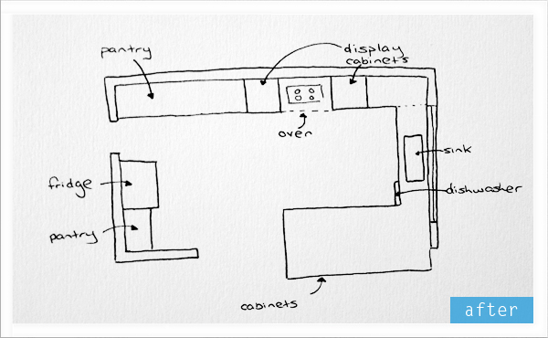 Next, the IKEA team demolished
the existing kitchen and began the installation
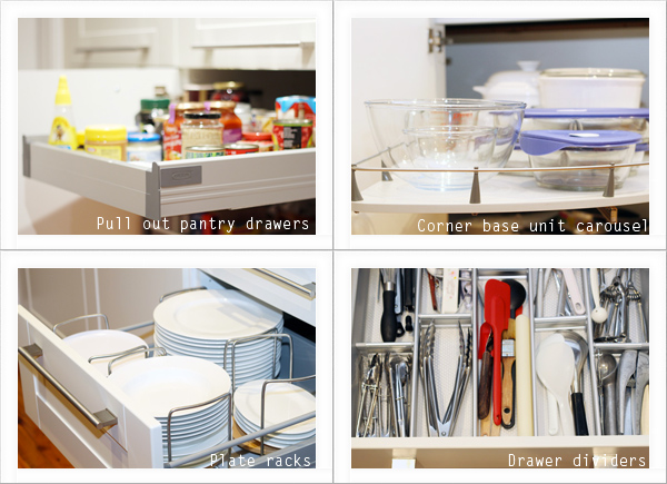
of the new kitchen fitting in all the clever storage ideas that you can get
with IKEA kitchens – pull out pantry drawers, plate racks, built in corner
carousels and adjustable drawer dividers.
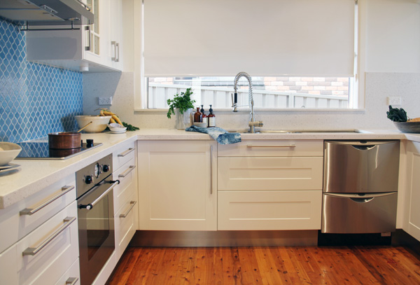
And now onto the completed kitchen! I asked my stylist friend Jane
Frosh if she would be interested in styling the kitchen for the final
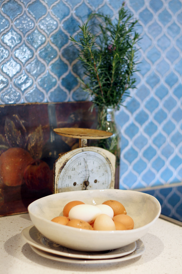
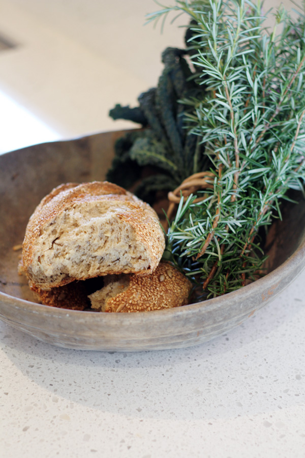
photographs. She even brought with her some fresh eggs laid by her chickens for
the shoot!
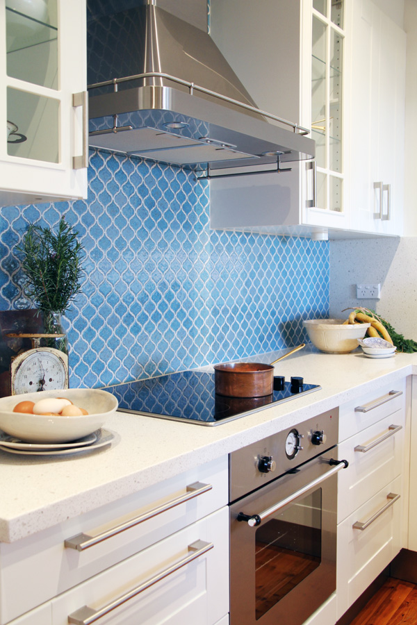
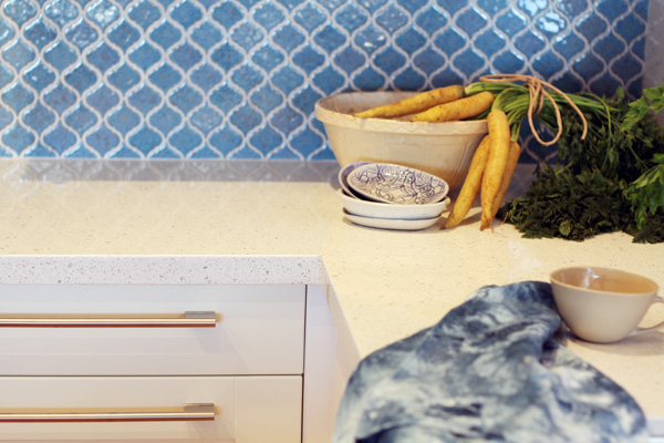
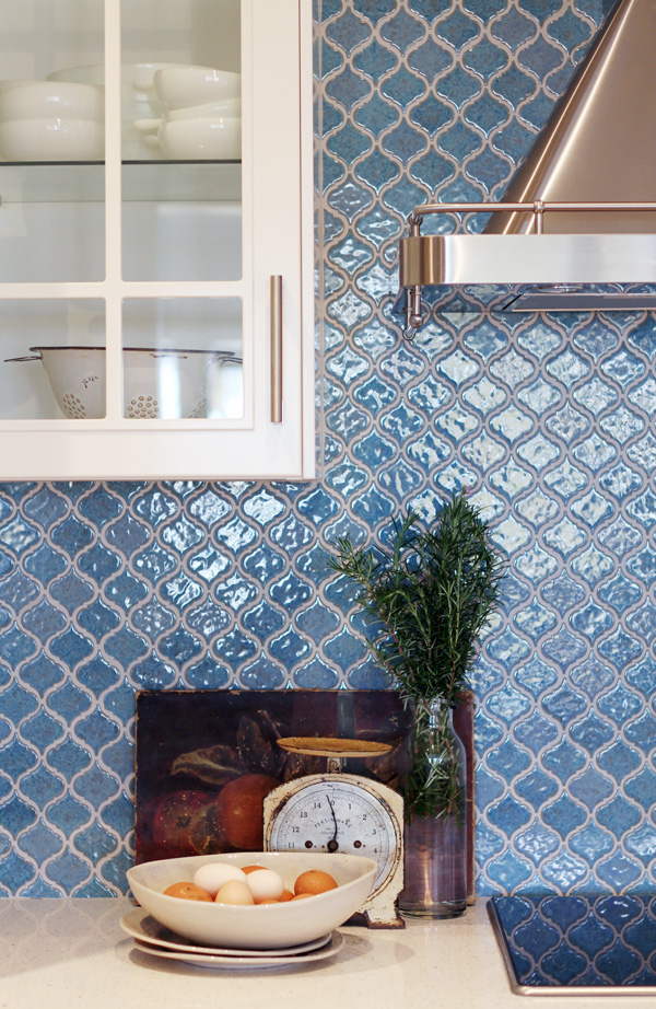
Last time I gave you a sneak peek into the tiles that were selected
for the backsplash. They weren’t an easy task for the tiler to fit but the
effort is worth it I think to create a wonderful and bright contrast to the all
white kitchen cabinets and benchtop. Diane was initially nervous about using
colour in the kitchen but I am so happy I could convince her to take the plunge.
Not that she needed much convincing because the tiles sparkle beautifully in
the daylight and the classic shape suits the style of her home nicely.
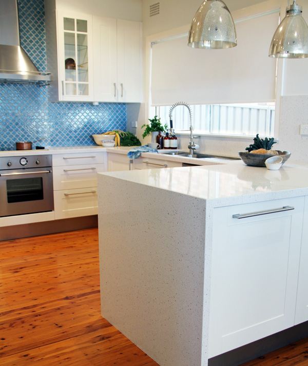
An extra deep bench was fitted at the entrance to the kitchen with
cabinets on both sides (front and back) for storage and mercury glass
pendant lights were chosen and fitted above the benchtop. All the details of
the pieces that were sourced for this kitchen can be found at the bottom of
this page.
The existing dishwasher was fitted into the ‘U’ shaped kitchen and the
new location of the oven under the bench has provided for more bench space.
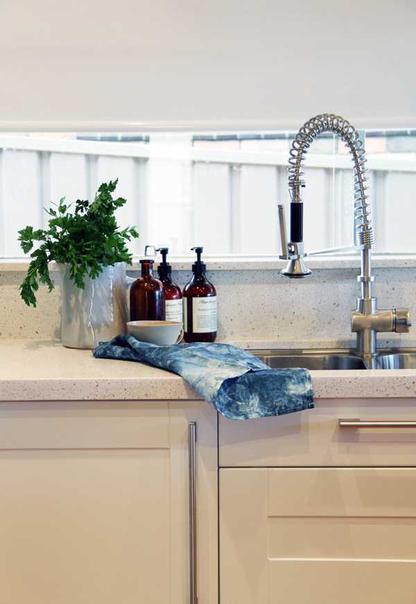
I love the tap. The caeserstone benchtop was ordered through IKEA and installed as a
backsplash on the small wall behind the sink to create a clean overall design.
The display cabinets on either side of the range hood will be used
to display Diane’s large collection of milk glass and more of her favourite
pieces.
The cabinets were extended to the ceiling with plasterboard by the
IKEA team to create a clean look.
“The display windows that light up from within, the range hood
canopy and the new kitchen layout are my favourite features of the new
kitchen,” says Diane. “They help transform the look and make it more effective
as a kitchen. You can see
some of my favorite antique or pretty display pieces that come to life under
the cabinet lights and the range hood is more powerful than my old oven.”
The Source List
- FAKTUM kitchen cabinets with ÄDEL doors and drawers - IKEA
- PERSONLIG Caeserstone benchtop
in Nougat - IKEA
- Vinna cabinet and drawer handles
- IKEA
- HJUVIK kitchen mixer
tap/handspray - IKEA
- BOHOLMEN Under mounted sink -
IKEA
- DÅTID OV8 fan-forced oven – IKEA
- ELDIG
HGC4K glass ceramic hob - IKEA
- DÅTID HW570 range hood - IKEA
- Dishwasher: Existing
- Lantern tiles for backsplash - Academy Tiles
- Industrial mercury pendant
lights - West Elm
- Wonki ware dinnerware and props sourced by Jane Frosh
I wanted to add a huge
thank you to Diane and her family, the IKEA team and Jane Frosh for all your
work on this project over the last few weeks and thank you to everyone who has
followed along the journey. If you have any questions on any of the items
sourced or about the process, please feel free to leave a comment below.

