The other week I shared with you the “before” photos of Diane’s kitchen and as you can see her old kitchen wasn’t too bad to begin with. The plan with the new kitchen though is to bring it more in line with what the family has in mind, to be better organised, function well and of course to look beautiful.
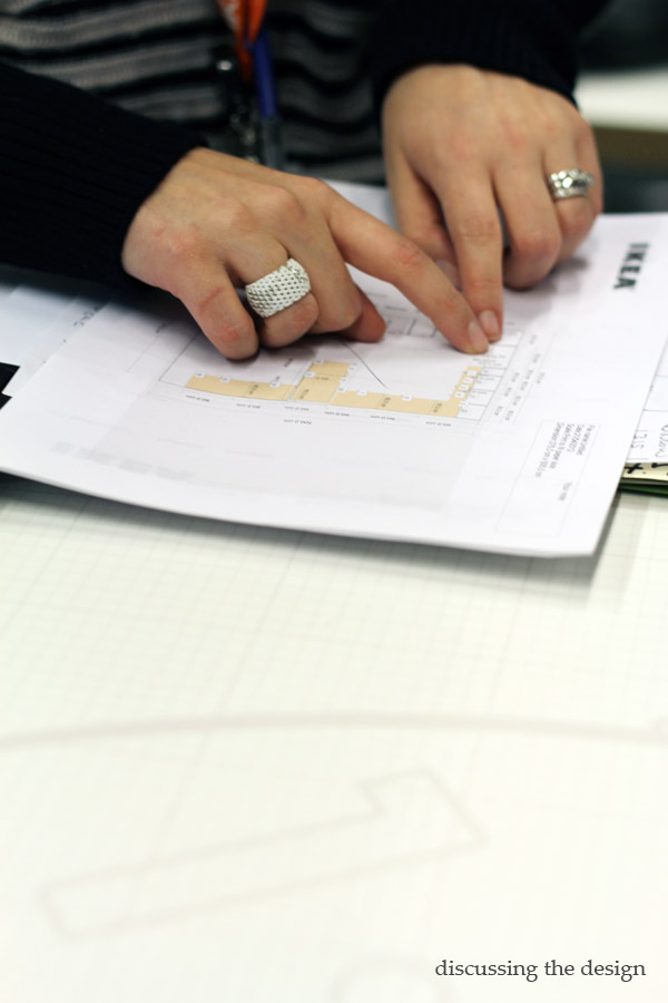
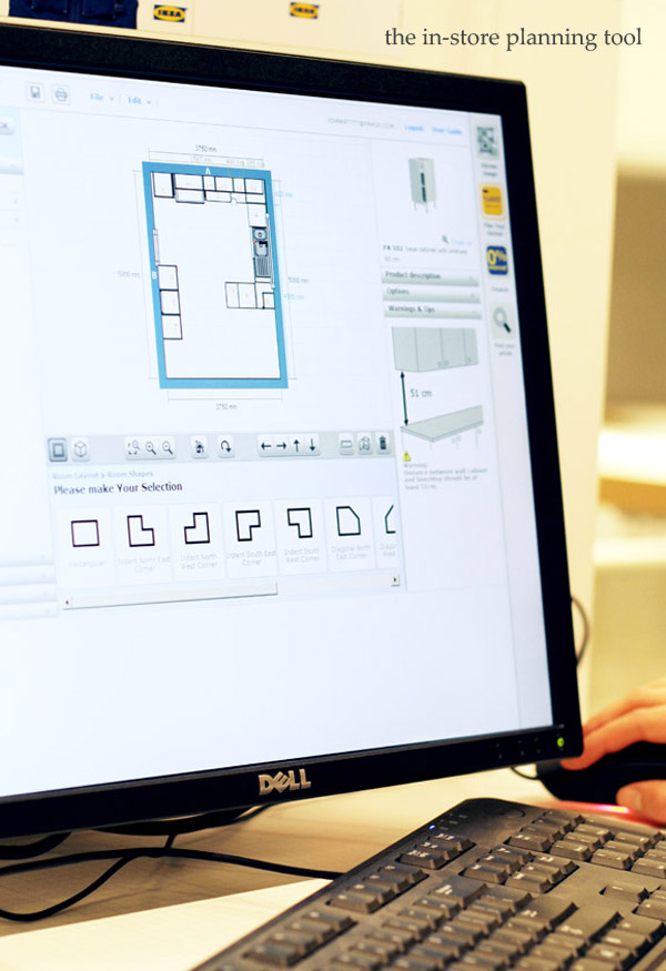
I visited IKEA with Diane the other week to use the in-store
planning tool. Have you used this tool before? Diane had played with the Selector tool at home so she
was already ahead in using a kitchen planning tool and had drafted an initial
design. We took advantage of the in-store visit to refine her design with
IKEA’s help and to plug in all the fancy details. By the end of the IKEA consultation
Diane was moving pieces around in the design tool like a pro. We talked through
where best to locate the oven and fridge and both IKEA and I were able to help
her plan the design to be more functional.
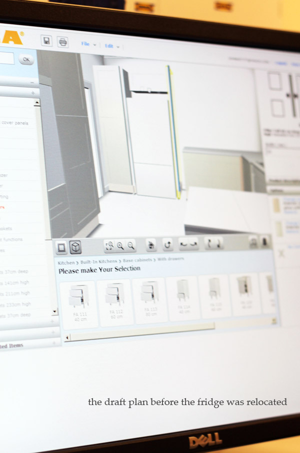
For example, in the draft design the fridge located in its current
position, next to the wall oven facing the main entrance to the kitchen. The only
problem with this location is that when the fridge door is open, it blocks the
side door entrance into the kitchen and with young kids that may come screaming around the corner it can be a
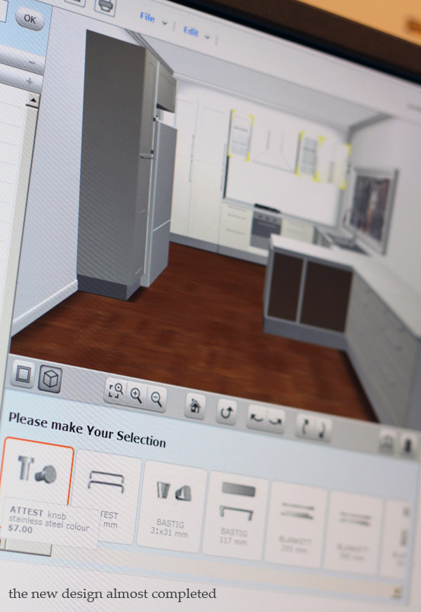
bit of a hazard. So we moved the fridge behind a wall so that it doesn’t block
the entrance and to also to create a more visually appealing design.
The
location of the oven had to also be considered in the design and we talked
about the “kitchen
work triangle” being the best configuration for the kitchen. In the draft
design the oven was to be located the furthest from the sink and bench tops
which would mean someone could be carrying hot food from the oven across the
length of the kitchen with kids running around between their feet. We decided
instead to tuck the oven under the bench top near the sink and this had an
added benefit of allowing the family to have more pantry space.
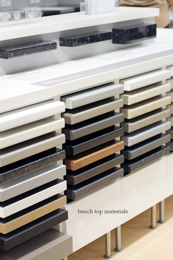
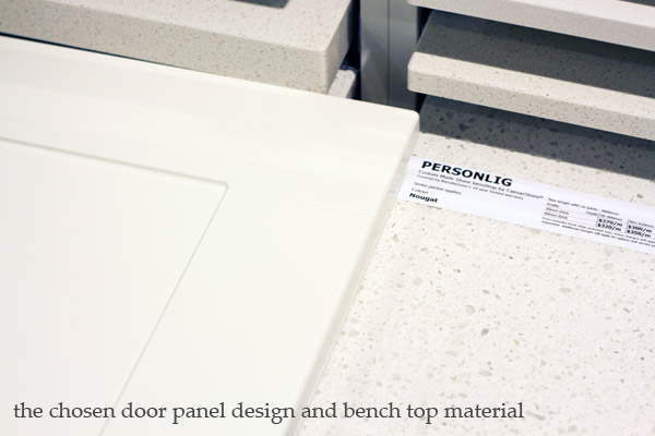
Diane also chose a new range hood from the new IKEA range, an oven,
stove, bench top and cabinets in the ÄDEL design to give Diane a bit of that
“Shaker” style look she loves. She will keep her existing dishwasher and
fridge. There are other benefits to the new design but it will be best to
explain these once the new kitchen is in and I can show them to you! In the
meantime, I asked Diane what she thought about the planning process:
How did you find the
in-store planning tool?
Diane: The in-store planning tool was great, I've never used one before it
helped me visualise what the kitchen would like. When I was in store being able
to look at a 3D picture and talking to staff helped me make confident
decisions.
Are you happy with the design of your kitchen or is there anything you are uncertain about?
Are you happy with the design of your kitchen or is there anything you are uncertain about?
Next on The IKEA Dream
Kitchen Project: The demolition

