The (pretend) brief
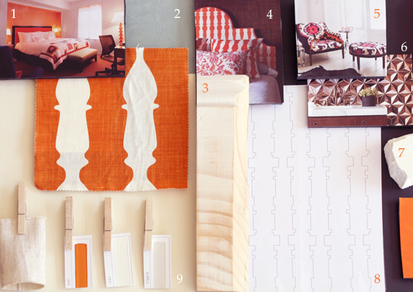
The client is the owner of a boutique hotel in Mexico called 'Orange'. The client feels the current rooms (image #1) need to be "glitzed up" to give them a 5 star hotel feel but to also add warmth to the room through natural materials and beautiful finishes.

The design
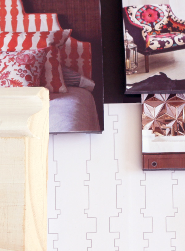
- The Christopher Farr cloth in orange colourway (which I lurve) is used for the curved bedhead (#4) and becomes a focal point of the room, especially when combined with the beautiful and 'glitzy' tiles (#6) that have been used in the recess behind the bed
- Furniture is upholstered in suzani fabrics (#4) and furniture legs painted in milk paint for an interesting matt / textured finish (#9)
- All walls are painted in Porters Paints 'Milk'
- The floors are a blonde timber with a diluted white paint wash and natural polish (#3)
- The finish of the ceiling is in white stucco that has been polished to a sheen (#2) to contrast with the natural wood and matt finishes used in the room
- The wallpaper I designed (#8) is inspired by the silhouette of the Christopher Farr cloth and will be used minimally just around the wall of the tiled recess behind the bed. The colours of the wallpaper will be very subtle in Porters Paints 'Milk' for the background and Porters Paints 'Rubble' for the lines
- Snowy white natural stone used to top the table (#7)
This is probably my favourite part of the course - creating concept boards from a brief, sourcing materials and preparing finishes for the space. Sometimes the designs aren't what I would normally choose for myself so it pushes me to explore outside of what I like.
If you are thinking of re-decorating a space you might like to give this a go? Source samples, images, finishes of all the pieces you want to use and arrange them on a board to see how they read together before committing to purchasing any items. Or you can use Photoshop if you are familiar with the tool but I personally like to have something tactile that I can refer to.
Have you tried this before for your own decorating projects? Did you find it useful?


