Now if you remember I was going to wallpaper a large framed piece and mount it behind the bed but to be honest, I dreaded all the work involved - papering large pieces of board so as not to damage the walls, mounting them and then cutting a frame to shape, painting the frame and fixing it to the wallpapered board. See what I mean?
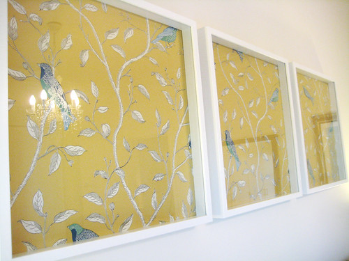
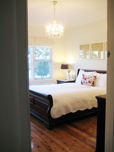
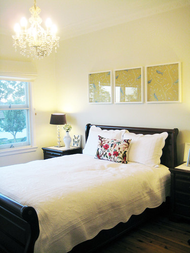
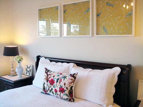
I have opted for the easier route - wallpaper displayed inside these IKEA Ribba frames.
 It means I can easily insert different paper in the future if I'm ever after a new look or I can take the frames down altogether. They are hung using 3M command strips which means no holes on the wall.


For now, I like the new look better than the way it looked before even though it wasn't bad to begin with. One day I may give the original plans a go but for now I want to see if I can live with the wallpaper design without getting bored of it before I go to all that trouble.


